
Lonely Planet is a site with many content types: articles, hotels, sights, activities, tours and much
more. Historically, the site hadnled all of these content types by making every list item a card. This made sense from a visual standpoint, as content types could be easily mixed together. The trouble with this approach, was that cards became a catch-all, and the site became endless pages of hard to navigate, nearly identical cards. We decided to revisit the lists, and think more strategically through which list and detail types (along with their accompanying features) best communicated the content at hand.
THE PROBLEM
Detail pages were cluttered, and hid useful features – like maps. Lists had become a confusing endless array of cards.
Research
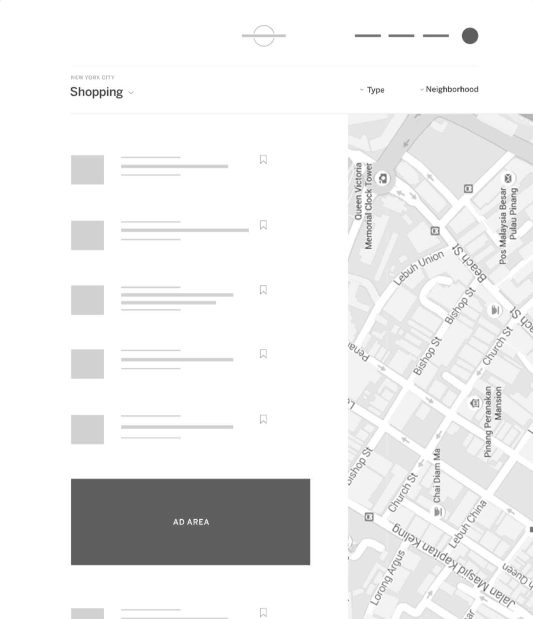
Our research told us that for the types of content we were trying to display, cards weren't always the best solution. We decided to switch everything to a more traditional list layout, with the possibility of thoughtfully and intentionally re-introducing cards in certain sections in the future.
Lists vs cards
To begin the design process, we started with the most finite and abundant design element in the project – The list item. We took the existing card, dissected it's components, and imagined how it would live in a more traditional list layout. From there, we mapped out the features our list pages would need.
Creating taxonomy
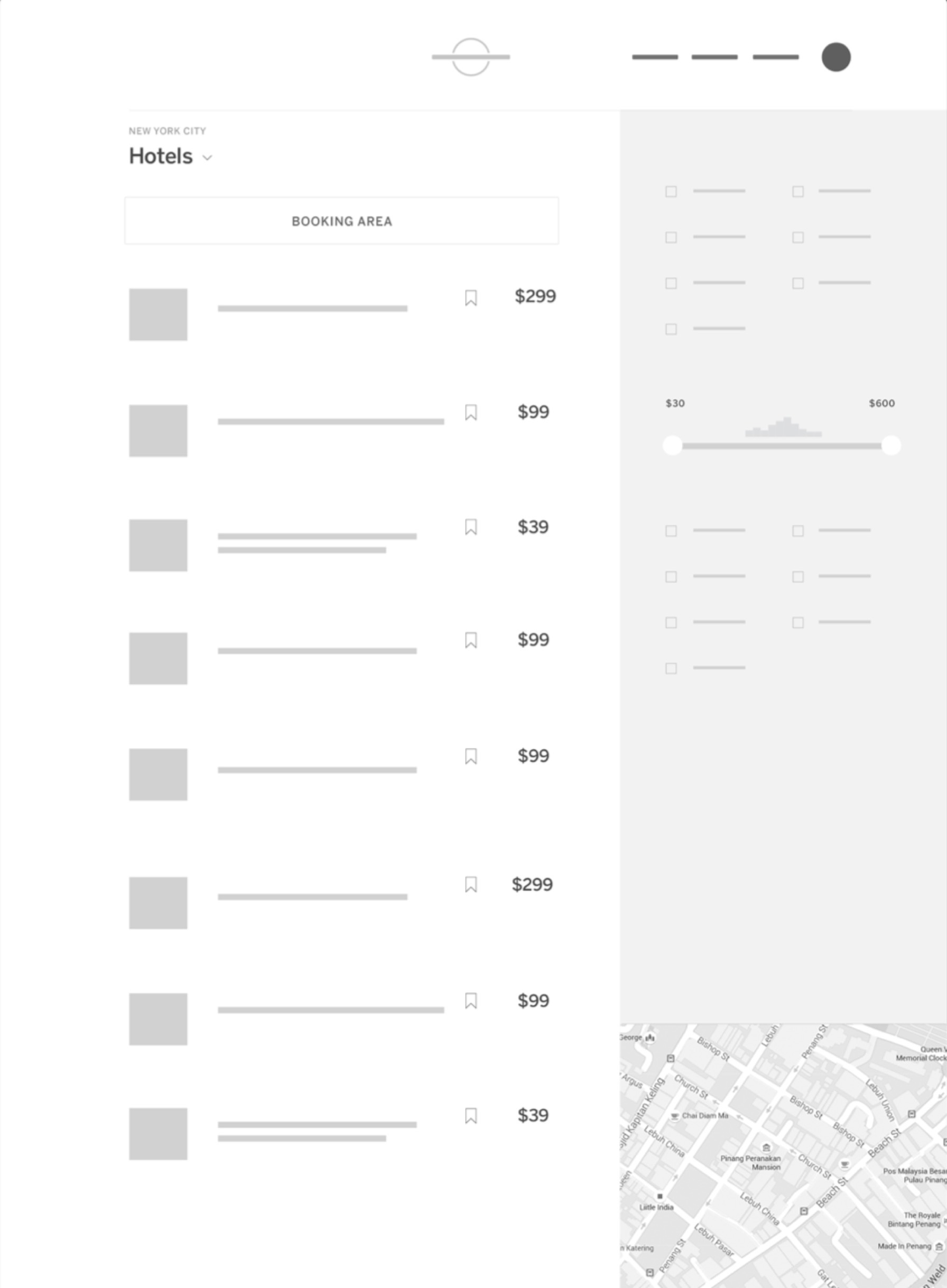
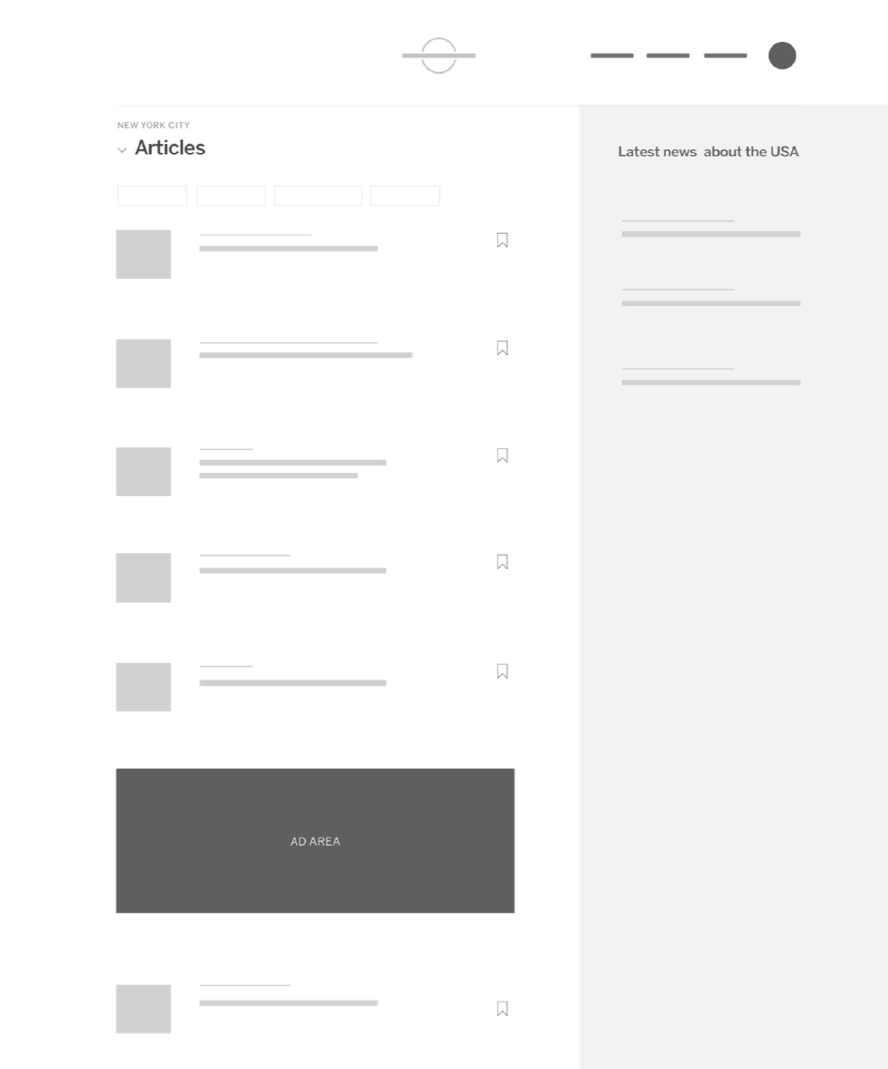
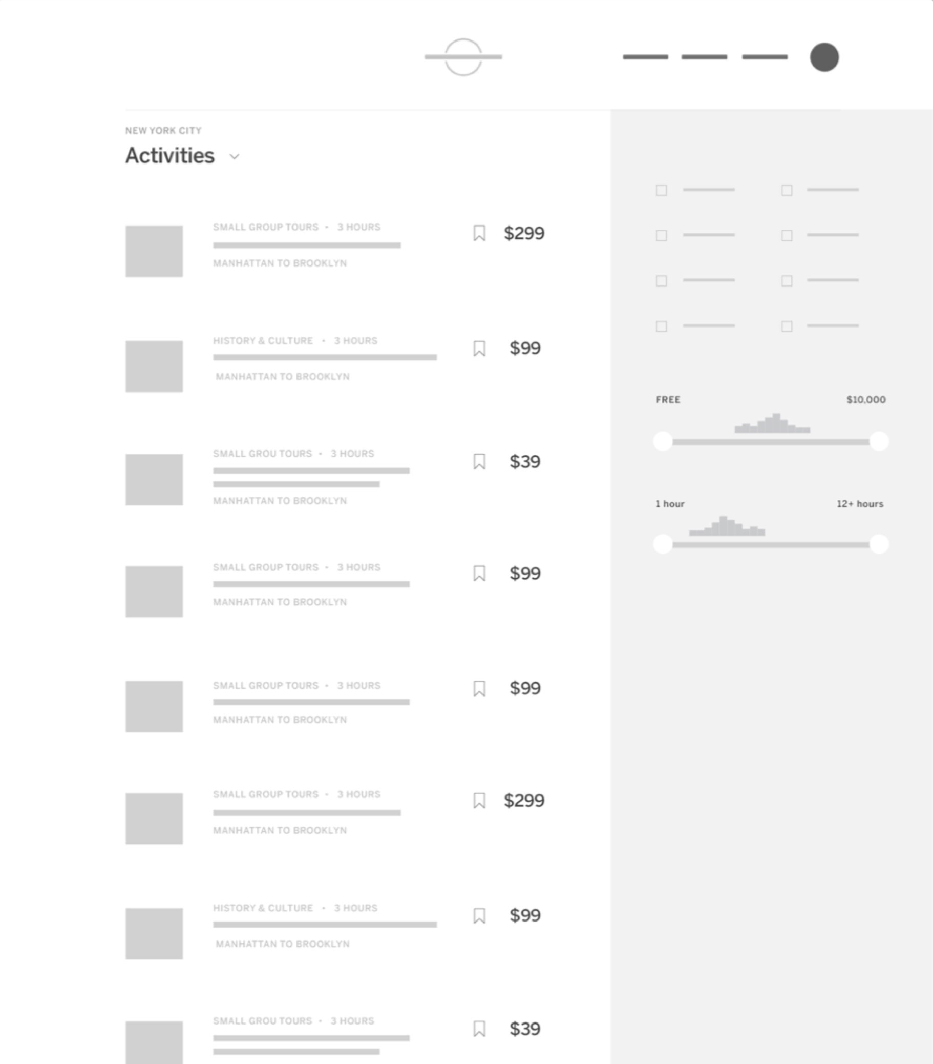
We ran through all of our content types, defined a purpose for each, identified differences and similarities, then grouped them into four main categories: Bookable places (hotels), Bookable non-places (tours, activities) Non-bookable places (shopping, sights, restaurants), and articles (long-form articles, news)
Creating taxonomy
We ran through all of our content types, defined a purpose for each, identified differences and similarities, then grouped them into four main categories: Bookable places (hotels), Bookable non-places (tours, activities) Non-bookable places (shopping, sights, restaurants), and articles (long-form articles, news)
Planning
With this new taxonomy in place, we were able to start planning for four main template categories. Some needed booking components, and filters, some needed maps, others were more editorial focused. We would use these group types to design our detail and point of interest pages as well.
Detail pages
The molecules of Lonely Planet
Our detail pages consist of Points of interest (restaurants, attractions, nightlife, etc) and bookable pages (hotels, activities, tours). The pages feature maps, imagery, and reviews from our authors. They enable our users to get to the heart of a destination.


Anatomy of a detail page
For the detail pages we followed a similar process to what we did for lists: start with the existing design, audit what does and doesn't need to be there, group the detail pages into categories, and create templates around our four main categories.
The final product
The Lonely Planet design team intentionally stays extremely lean. We sometimes bring in contractors for support. One of our favorite teams to work with is at an agency called Ueno. We had just worked with Ueno on our destinations project, so it made sense to bring them in again. Together, we continued evolving our design system. Special thanks to Haraldur Thorleifsson & Ben Mingo!